Creating custom dashboards in Sage Intacct

Dashboards should be more than just visually appealing. Instead, they need to deliver answers to critical questions at a glance. By creating custom dashboards in Sage Intacct, you can consolidate your key metrics, reports, and approvals into one streamlined view. This empowers leaders to access vital data instantly, eliminating the need to search or wait for monthly reports. In this blog, we’ll explore the powerful capabilities and advantages of Sage Intacct custom dashboards, along with best practices and a step-by-step guide to help you create them effectively.
Why custom dashboards in Sage Intacct matter
A good dashboard is your daily control center, mixing financials, operations, and tasks on one screen. Each person can see what matters for them. Benefits include:
- Faster, smarter choices: See trends and issues without jumping between modules or spreadsheets
- Fewer emails: People get answers themselves, so you answer fewer report requests
- Context-rich insights: Connect financials with dimensions like department, project, or customer to spot what affects your results
- Stronger controls: Role-based permissions and filters ensure users only see what’s needed
Dashboards support:
- Financials: Profit/loss, balance sheet, cash
- Operations: Project use, sales pipeline, open POs
- Performance cards: DSO, revenue per worker
- Interactive tools: Smart Links, shortcuts, approvals


Expert training services
Empower your team with the skills they need to perform at their best. Rand Group offers flexible training options to help your employees get the most out of Sage Intacct. Whether your goal is to onboard new users or learn how to use new features, our experts provide the guidance to ensure success.
Step-by-step: Creating a dashboard in Sage Intacct
Step 1: Start a new dashboard
- Go to Dashboards in the menu
- Click Create new dashboard
- Name it clearly. Example: “Ops Manager – West | Budgets, Receivables, Approvals”
Tip: Begin dashboard names with a role or area, like “FIN – CFO.”

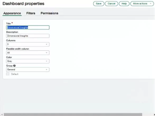
Step 2: Set layout and style
- Go to the Appearance area
- Pick the number of columns and adjust their sizes
- Common setup: Two columns: left for major charts, right for quick stats or tasks
- Group related items. Use color or headers like “Revenue,” “Cash,” or “Approval”
Best practices:
- Place key metrics top left
- Use cards for quick stats like Cash Balance or DSO
- Keep lower sections for reports or lists
Step 3: Add audience-aligned filters
- Open the Filters tab
- Add filters for dimensions like Department, Project, or Customer
- Set defaults to match the dashboard’s users. For example, Marketing for a Marketing Manager
Sample uses:
- Managers see only their region’s results
- Project leads see active jobs from the last 90 days
- Executives view all entities or drill into specifics
Tip: Use filters with time scales like “This Month” so dashboards update automatically.

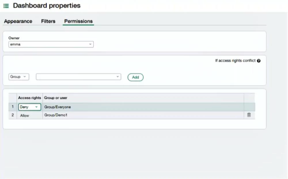
Step 4: Set permissions
- Open Permissions
- Give access by person or role group; only allow broad access if all content is safe
- For sensitive info, limit access and check your security policies
Tips:
- Make role-based groups like “Finance Managers” or “AP Team”
- Review who has access at least once a quarter
Step 5: Save and use the components library
- Save your dashboard
- Go back to the Dashboards list and pick View Components, or open the dashboard and click “+”
Choose items to add, such as:
- Charts: line, bar, pie, combo
- Reports: financial, custom
- Performance cards: cash, receivables due
- Lists: approvals, open items
- Info: message boards, links
- Smart links: quick navigation
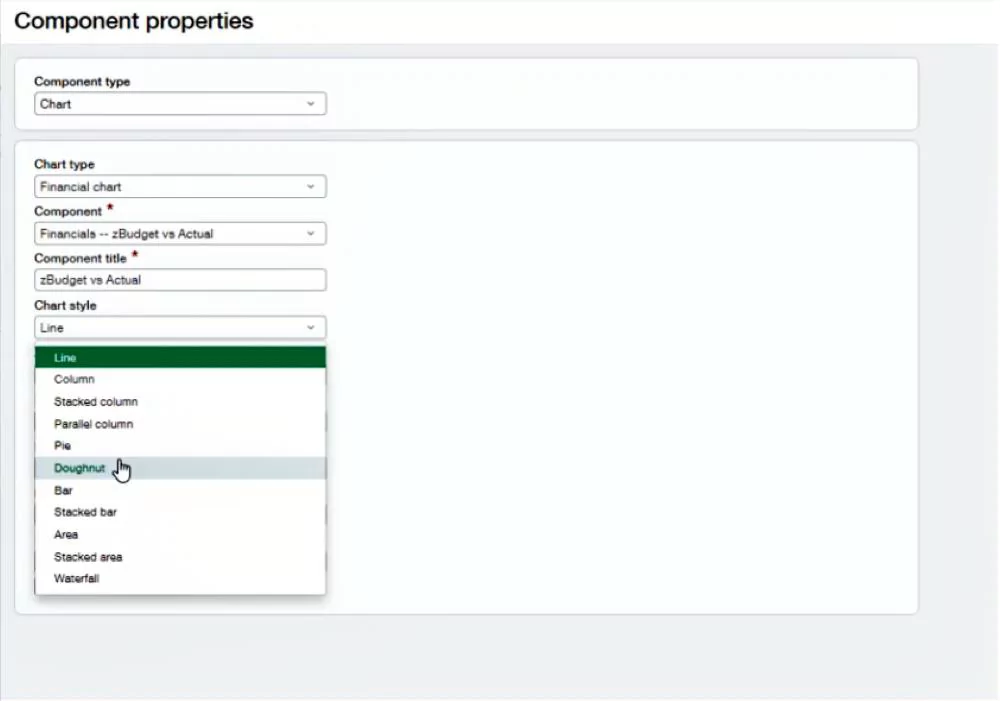
Step 6: Add components with purpose
Each item should have a useful title. Examples: “Cash runway (weeks),” not just “Cash”
- Adjust filters to match dashboard filters or narrow further
- Sort or limit lists to key items, like top 10 overdue invoices
Layout guide:
- Top: Two to four performance cards for your “pulse” metrics
- Middle: One or two charts showing trends
- Bottom: Action lists or deep-dive reports
Step 7: Test and share
- Preview as the intended user, or ask someone to review
- If loading is slow, reduce big reports or adjust caching
- Test drill-down links
- Share the dashboard and provide basic usage notes
Tips for creating clear, quick dashboards
- Limit the number of components to 8-12
- Use trend charts over one-time stats
- Make KPI definitions clear and shared
- Use cards for fast-glance metrics; color code as needed
- Keep lists brief—top 10 items, for example
- Reuse ready reports across dashboards
- Update dashboards every quarter as needs change
Solving common dashboard issues
- Slow loads: Move big reports off the main dashboard
- Wrong users see data: Tighten dashboard and report permissions
- Data mismatch: Align filters, dates, and settings
- Too many dashboards: Combine by role and use filters
Measuring dashboard success
Keep track of outcomes for the first couple of months and share wins with the team.
- Actions taken because of dashboard facts
- Time saved by fewer report requests
- Faster close or collections cycles
- More frequent dashboard views

White Paper
View performance from every angle with Sage Intacct Dimensions
Sage Intacct’s reporting tools come equipped with Dimensions, offering you the flexibility to group, sort, filter, and visually expand data in Sage Intact. Check out the data sheet to discover how Dimensions empower you to make smarter decisions with comprehensive, multi-angle analysis.
Sample dashboards by role
CEO
Purpose: Snapshot for quick insight into daily key numbers
- Cards: Cash balance, revenue vs. plan, margin, expenses, DSO
- Charts: 12-month revenue, cash flows
- Reports: P&L, balance sheet
- Lists: Top overdue invoices and payments
- Links: Monthly KPI or board pack
Controller / Finance operations
Purpose: Spot exceptions to speed closing tasks
- Cards: Close progress, open entries, unreconciled transactions
- Charts: Department variances, AP/AR trends
- Reports: Exceptions, accruals
- Lists: Unposted entries, bank rec errors
- Links: Journal, bank, or vendor actions
Department manager
Purpose: See spending and approve items easily
- Cards: Budget left, open POs, campaign ROI
- Charts: Expenses vs. budget, pipeline trends
- Reports: Budget details
- Lists: Pending expenses, vendor bills
- Filters: Department and date
Project manager
Purpose: Tie results to actions and act fast
- Cards: Utilization rate, margin, WIP balance
- Charts: Revenue by project, hours by staff
- Reports: Project results, unbilled items
- Lists: Timecards for approval, change orders
- Filters: Project and manager
Nonprofit program director
Purpose: Support oversight of funding and outcomes
- Cards: Grant balance, budget vs. spend, program impact
- Charts: Expenses, funding mix
- Reports: Activities by program
- Lists: Pending approvals, due reports
- Filters: Fund and grant
Conclusion
Custom Sage Intacct dashboards give each person their key numbers with needed guardrails. Start simple, focus layouts, and add only valuable components. These steps help you launch dashboards that speed up cycles and keep people aligned, without extra reporting effort. Want to improve more? After your first dashboard, build an “Exceptions” dashboard for outliers and open tasks. This directs focus where it’s most needed.
Ensure you get the most out of Sage Intacct by partnering with Rand Group. Our expert guidance helps optimize your workflows and gain visibility. Contact us today to learn how we can help support your business growth.