Tip of the Month
Dynamics 365 Customer Engagement Tip of the Month: How to create charts
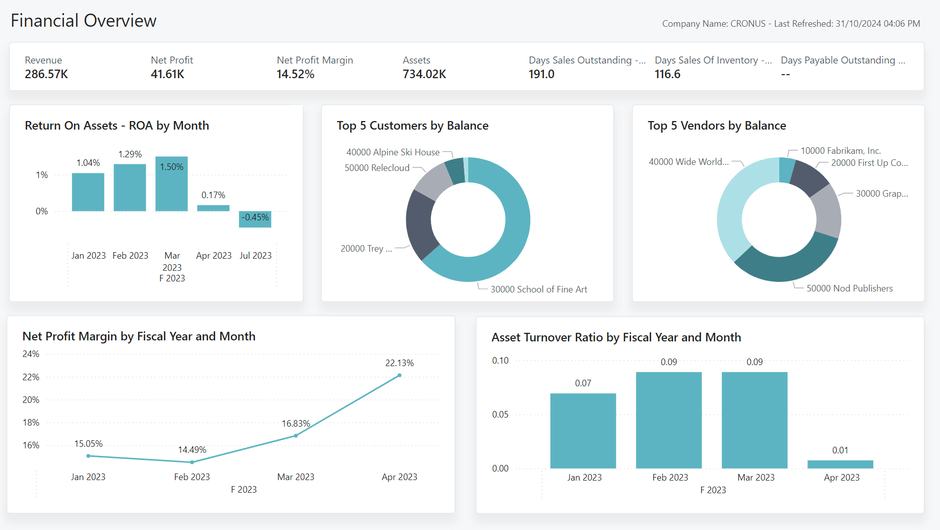
Visualizing data is one of the most powerful ways to gain insights to make strategic growth decisions. While raw data in tables can be overwhelming, charts bring your information to life, highlighting patterns, trends, and key metrics in a way that’s easy to understand at a glance. In this tip of the month, we’ll walk you through how to create charts from list views and how to add them to dashboards in your Microsoft D365 Customer Engagement for more effective data analysis.
How to add charts from a list view in D365 CRM
Steps
- Select the relevant module and entity to open the list view
- Select the appropriate view
- Select Show Chart on the left side of the ribbon
- Once the chart pane is open, select the three dots and click “+ New” to create a new chart
- From here you can select what type of chart you would like (bar, line, pie, etc.)
- The Legend Entries (Series) will be your Y axis. You can add multiple to this axis by clicking “+ Add a series”
- The Horizontal (Category) Axis Labels will be your X axis. You can add multiple labels to this axis by clicking “Add a category”
- Once all customizations are completed, click the “Save & Close” button
How to add a chart to a dashboard
Steps:
- In the sitemap, select Dashboards
- Either create a new Dashboard or edit an existing Dashboard
- From here you will see tiles, in the relevant tile, select “Insert Chart” and select the relevant entity and view of the chart you would like to insert.
- This can also be done through selecting the relevant tile and clicking “Chart” in the top ribbon.
- Once you have edited the dashboard to your liking, click “Save” in the top ribbon and then close.
Why this tip matters
Strong data visualization isn’t just about aesthetics, it’s about enabling your team to work smarter, faster, and with greater clarity. When everyone can quickly interpret the data in front of them, collaboration improves and strategy becomes more agile.
With just a few simple steps, you can turn static data into dynamic visuals that enhance your D365 Customer Engagement application. Whether you’re tracking performance, sales trends, or customer activity, charts offer a clear and impactful way to stay on top of your data.
Our expert Microsoft consultants can help you enable this tip and other processes to optimize your application use. Contact our team today to talk to an expert.


